UI & Data Visualization
Categorical scale
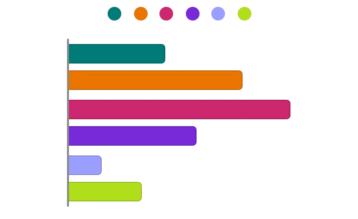
A data visualization scale for representing non-numeric data, and distinguishing un-ordered categories.
Categorical color scales are qualitative.
How it affects UI design
When creating color scales, interpolating in various color spaces will result in different colors or appearance. Use a color appearance model if trying to make your color scale perceptually balanced.
Do not rely on color choice alone to make data visualizations accessible. Additional considerations beyond color and contrast may be necessary.
Categorical scales may be more prone to color conflicts for people who have a color vision deficiency.
Sources:
- Lisa Charlotte Muth. Which color scale to use when visualizing data. Datawrapper. https://blog.datawrapper.de/which-color-scale-to-use-in-data-vis/
- Color for Data Visualization. Adobe Spectrum. https://spectrum.adobe.com/page/color-for-data-visualization/