Color appearance phenomena
Helmholtz–Kohlrausch effect
(Chromatic luminance)
The illusion where increased saturation (or chroma) of a color is perceived as an increase in the color's lightness.
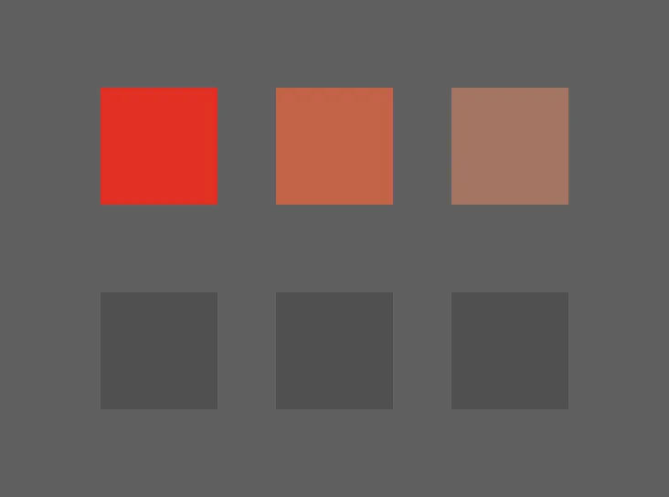
How it affects UI design
When designing interfaces, be aware of this illusion.
Do not try to subjectively match colors by their apparent lightness, as this can result in a false alignment. People with a color vision deficiency will not experience this illusion to the same degree (if at all).
Use accurate measurements for lightness, such as with color appearance models.
Use a tool to check contrast in order to ensure appropriate contrast is provided, regardless of the effects of chromatic luminance.
WCAG 1.4.3 (contrast minimum) provides a general threshold for making text & components perceivable to most sighted users.
Sources:
- Mark D. Fairchild (2013). Color Appearance Models. 3rd edition. John Wiley & Sons, Ltd. Pages 123-124
- R.W.G. Hunt, M.R. Pointer (2011). Measuring Colour. John Wiley & Sons, Inc. Pages 440
- Janos Schanda (2007). Colorimetry: understanding the CIE system. John Wiley & Sons, Inc. Pages 276-277
- Helmholtz–Kohlrausch effect. Wikipedia. https://en.wikipedia.org/wiki/Helmholtz%E2%80%93Kohlrausch_effect
- Success Criterion 1.4.3 Contrast (Minimum). Web Content Accessibility Guidelines (WCAG) 2.1. https://www.w3.org/TR/WCAG21/#contrast-minimum