Relationships
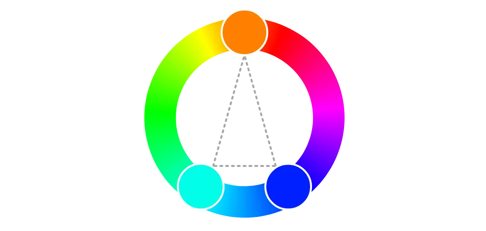
Split complementary colors
Colors positioned on the color wheel along an isosceles triangle. One of Johannes Itten's "harmonious chords": geometric points demonstrating color "notes" as a basis for composition.
How it affects UI design
Split complementary colors can be used as secondary accent colors in a UI color palette for both a dynamic and harmonious appearance.
A split complementary palette may be more prone to color conflicts for people who have a color vision deficiency.
Hue is treated differently between color spaces, which can affect which colors are considered to be split complementary.
- Helpful tools:
- Adobe color: https://color.adobe.com/
Sources:
- Linda Holtzschue (2017). Understanding color: an introduction for designers. 5th edition. John Wiley & Sons, Inc. Pages 140
- Mary Stewart (2006). Launching the imagination: a comprehensive guide to basic design. 2nd edition. McGraw-Hill. Pages 63
- Juliette Aristides (2008). Classical painting atelier: a contemporary guide to traditional studio practice. Watson-Guptill Publications. Pages 81