Properties of color
Chromaticity
The hue and colorfulness of a color, independent from a color's lightness. "Chromaticity" is a term primarily used in reference to the CIE chromaticity diagram.
CIE chromaticity diagram
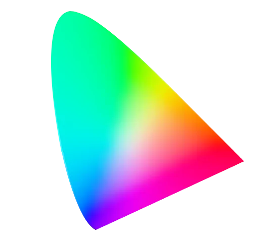
The International Commission on Illumination (CIE) chromaticity diagram is a cross-section of XYZ color space and maps the visible spectrum.
This chromaticity diagram is a standard for illustrating many important aspects of color vision such as the Abney effect, Bezold–Brücke shift, color confusion lines of color vision deficiencies, color temperature and color space gamuts (among others).
How it affects UI design
The chroma of a color can be perceived differently between light and dark modes as a result of the Bezold effect.
The chroma of a color can be perceived differently when adjacent to other colors of varying chroma due to simultaneous contrast.
Lower chroma colors can be more difficult to distinguish for people with color vision deficiencies.
Related topics
Sources:
- Thomas Norton, David Corliss, James Bailey (2020). The Psychophysical Measurement of Visual Function. 1st edition. Butterworth-Heinemann. Pages 283
- Chromaticity. Wikipedia. https://en.wikipedia.org/wiki/Chromaticity