Properties of color
Opacity
(Alpha, transparency, translucency)
Opacity is a property that describes how much you can see through a color.
A color that cannot be seen through is fully opaque. A color that be seen through but still perceived is translucent. A color that is fully seen through and not perceived is transparent.
In many implemented color spaces, opacity is controlled with an alpha channel.
How it affects UI design
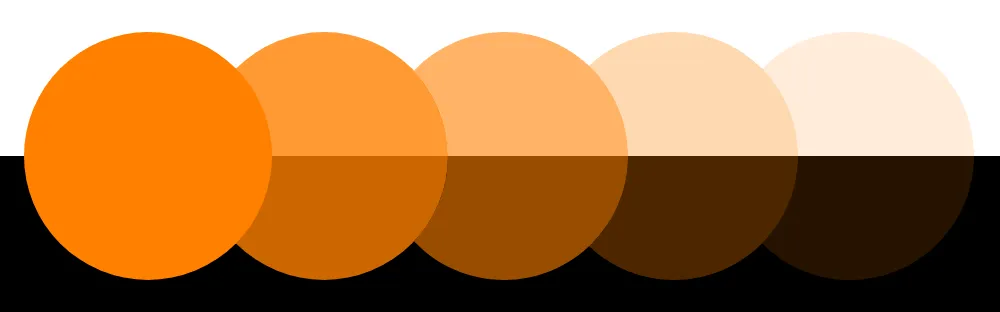
Opacity can be used to create subtle, or low-contrast colors. Translucent colors adapt well when placed on different surfaces, and retain a consistent WCAG relative luminance contrast.
Opacities do not have the same
Related topics
Sources:
- Linda Holtzschue (2017). Understanding color: an introduction for designers. 5th edition. John Wiley & Sons, Inc. Pages 36
- Transparency and translucency. Wikipedia. https://en.wikipedia.org/wiki/Transparency_and_translucency