Color appearance phenomena
Purkinje shift
(Purkinje effect)
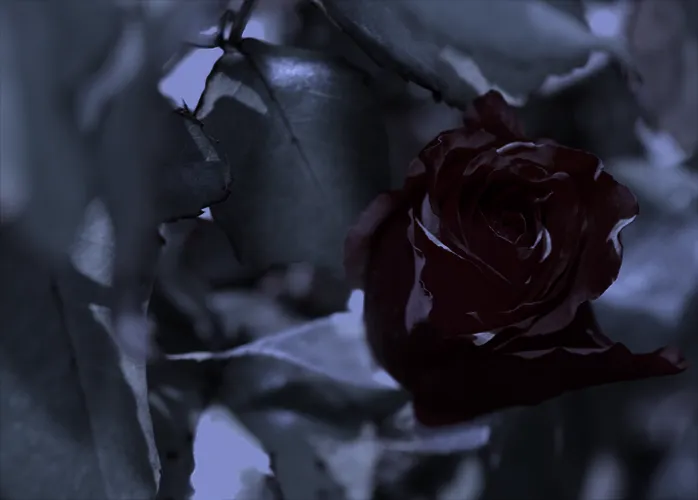
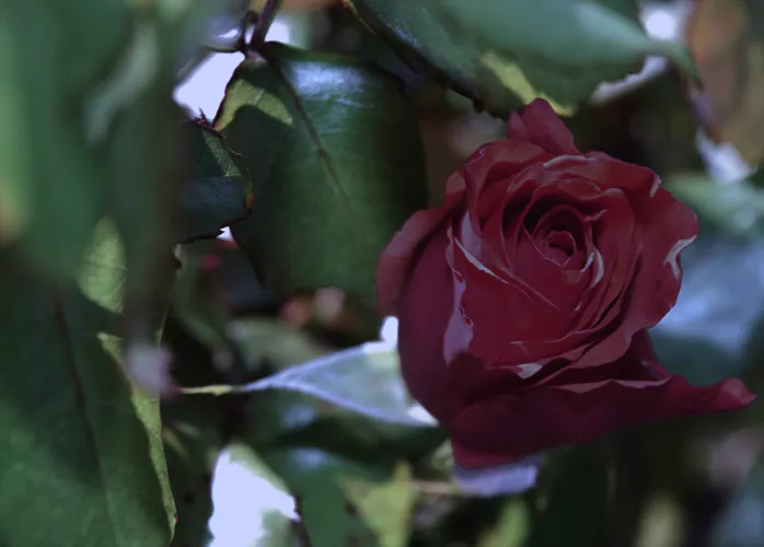
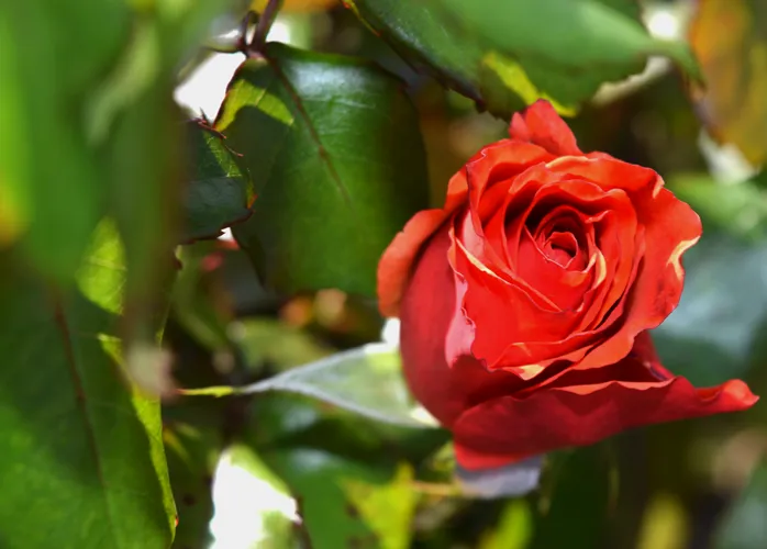
Peak wavelength sensitivity of photoreceptors shifts towards blue in dark light during dark adaptation. Reds will appear relatively darker than other colors as light levels decrease.
How it affects UI design
Warm colors should shift towards cooler hues as they get darker if you want colors to emulate properties of the physical world.
Related topics
Sources:
- Mark D. Fairchild (2013). Color Appearance Models. 3rd edition. John Wiley & Sons, Ltd. Pages 10, 70
- R.W.G. Hunt, M.R. Pointer (2011). Measuring Colour. John Wiley & Sons, Inc. Pages 446
- Purkinje effect. Wikipedia. https://en.wikipedia.org/wiki/Purkinje_effect