UI & Data Visualization
Color theme
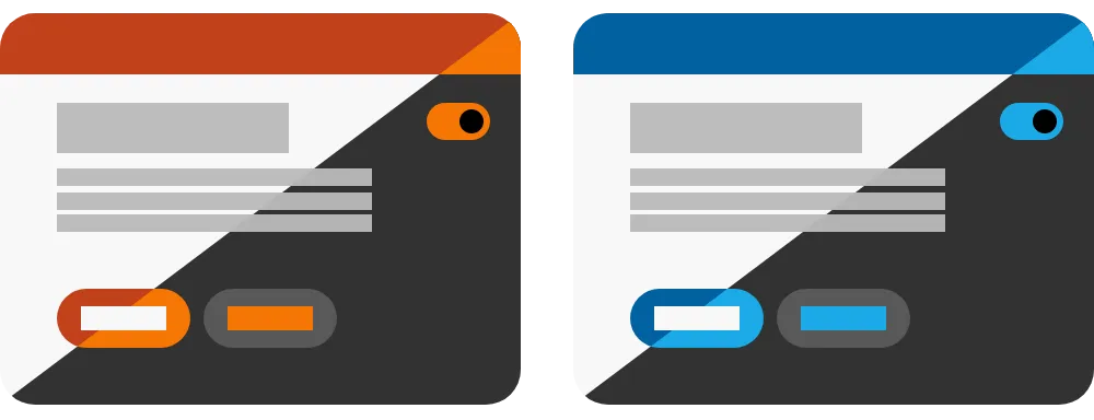
A collection of color scales applied to a user interface design system.
Color themes can be used to support light mode, dark mode, increase contrast mode, or different brands.
How it affects UI design
A light theme and dark theme can be helpful for supporting light and dark modes using the prefers-color-scheme media query.
A unique theme can be used to support increase contrast mode using the prefers-contrast media query.
Do not create custom themes for windows high contrast mode. This mode is intended to provide end-user control over color.
Not all people have the same contrast sensitivity. WCAG 1.4.3 (contrast minimum) provides a general threshold for making text & components perceivable to most sighted users.
In some cases, users may benefit from higher contrast than recommended minimums, whereas other users may be negatively impacted by high contrast interfaces. Consider personalization settings to give users the ability to adjust contrast to meet their needs.
Related topics
- Light sensitivity
- Light & dark adaptation
- Color vision deficiency
- Bezold effect
- Chromatic adaptation
- Helmholtz–Kohlrausch effect
- Color constancy
- Contrast sensitivity
- Contrast discrimination
- Simultaneous contrast
- Polygonal colors
- Relative luminance
- APCA
- Light mode
- Dark mode
- Increase contrast mode
- High contrast mode
- Color scale