Properties of color
Tone
A less colorful version of a color, generally equal to "adding gray," or adding the color's complement.
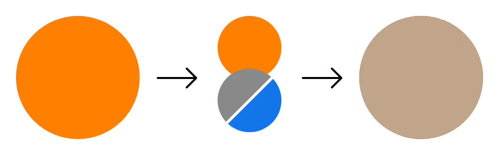
How it affects UI design
A color's appearance can be affected by the lightness or darkness of its background. For dark mode, less saturated tones may appear more appropriate and can be less strain on a user's eyes.
Related topics
Sources:
- Linda Holtzschue (2017). Understanding color: an introduction for designers. 5th edition. John Wiley & Sons, Inc. Pages 89
- Mary Stewart (2006). Launching the imagination: a comprehensive guide to basic design. 2nd edition. McGraw-Hill. Pages 384