Sensory adaptations
Chromatic adaptation
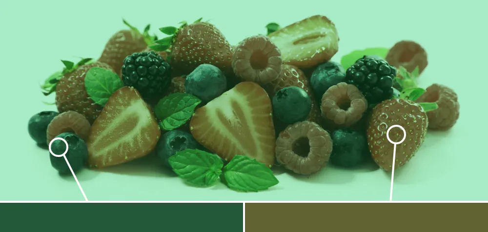
A process of the visual system that adjusts to preserve color appearance in response to colored light.
This adaptation occurs by suppressing the sensitivity of cones under prolonged exposure. This partially isolates the remaining cones to measure spectral sensitivity (or hue).
Examples
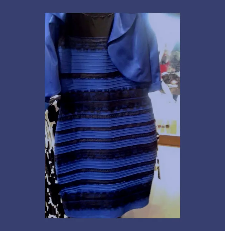
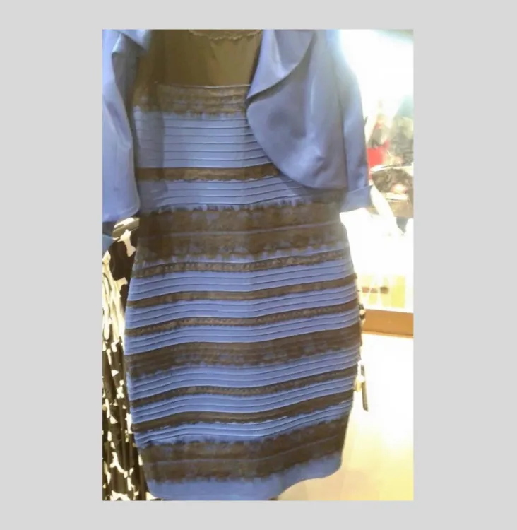
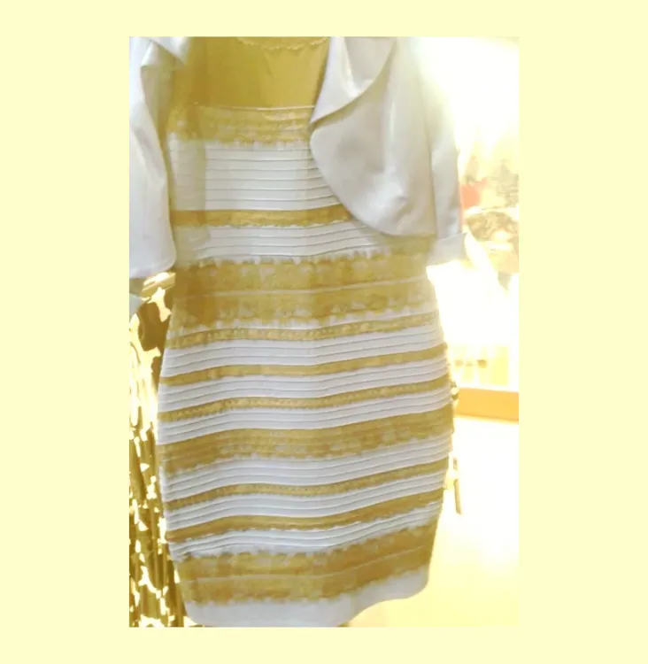
"The dress"
This illusion is the result of improper color identification due to chromatic adaptation, or color constancy, and is known as "chromatic bias". Based on viewing conditions, or surrounding light, the dress may appear to be blue and black or white and gold.
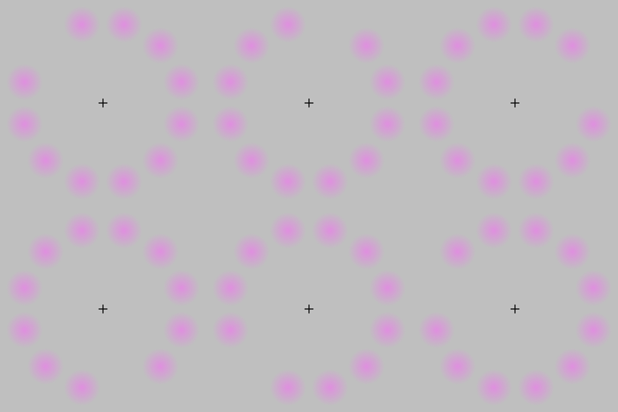
Afterimage illusion
An illusion where an image continues to appear after you stop looking at it.
The illusion is caused by chromatic adaptation. Opposing (complementary) colors are experienced due to the color opponent process.
How it affects UI design
The appearance of some colors may be misidentified in certain environments, or more strongly affected by simultaneous contrast.
Coloration of an entire interface (such as blue-grays or browns) can result in chromatic adaptation. This can cause other colors in the interface to take on a different appearance.
Animations, scrolling, and page transitions may create afterimages, especially for high contrast elements. This may affect users with motion sensitivities.
Sources:
- Thomas Norton, David Corliss, James Bailey (2020). The Psychophysical Measurement of Visual Function. 1st edition. Butterworth-Heinemann. Pages 224-225, 283
- Mark D. Fairchild (2013). Color Appearance Models. 3rd edition. John Wiley & Sons, Ltd. Pages 25-26
- Linda Holtzschue (2017). Understanding color: an introduction for designers. 5th edition. John Wiley & Sons, Inc. Pages 221
- Mary Stewart (2006). Launching the imagination: a comprehensive guide to basic design. 2nd edition. McGraw-Hill. Pages 377
- Chromatic adaptation. Wikipedia. https://en.wikipedia.org/wiki/Chromatic_adaptation