Properties of color
Chroma
(Colorfulness, saturation, brilliance, vibrancy)
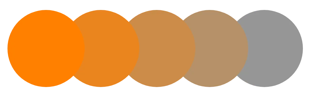
The colorfulness of a color, independent from a color's lightness. A change in this property results in a tone.
In color spaces, chroma, brilliance, and saturation are unique measurements.
How it affects UI design
The chroma of a color can be perceived differently between light and dark modes (or other color themes) as a result of the Bezold effect.
The chroma of a color can be perceived differently when adjacent to other colors of varying chroma due to simultaneous contrast.
Lower chroma colors can be more difficult to distinguish for people with color vision deficiencies.
Related topics
Sources:
- Juliette Aristides (2008). Classical painting atelier: a contemporary guide to traditional studio practice. Watson-Guptill Publications. Pages 81-82
- Mary Stewart (2006). Launching the imagination: a comprehensive guide to basic design. 2nd edition. McGraw-Hill. Pages 378
- Linda Holtzschue (2017). Understanding color: an introduction for designers. 5th edition. John Wiley & Sons, Inc. Pages 64, 232
- Colorfulness. Wikipedia. https://en.wikipedia.org/wiki/Colorfulness