Color appearance phenomena
Chromostereopsis
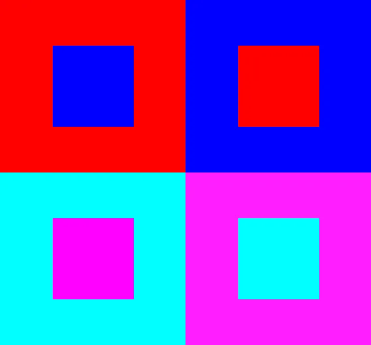
An illusion of depth or "vibration" created when certain colors are placed next to one another. Chromostereopsis is generally attributed to chromatic aberration.
How it affects UI design
Do not juxtapose high chroma colors (especially spectral colors). Exaggerated focal depths from this illusion can be difficult for people to focus on and could cause eye strain.
Effects of chromostereopsis may be exaggerated by corrective lenses for myopia or hyperopia.
Text should never be displayed using a combination of colors that create this illusion, as it will affect legibility.
This illusion can affect the experience of dark mode or dark color themes.
Sources:
- Chromostereopsis. Vision excellence: optometry & orthokeratology. https://www.visionexcellence.com.au/chromostereopsis/
- Chromostereopsis. Wikipedia. https://en.wikipedia.org/wiki/Chromostereopsis