Properties of color
Lightness
(Value, brightness)
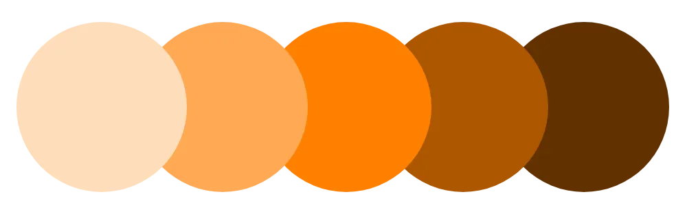
The amount of lightness of a color, or its relative proximity to white or black. A change in this property results in a tint or shade.
In color spaces, lightness, brightness, and value are unique measurements.
How it affects UI design
The lightness of a color can be perceived differently between light and dark modes (or other color themes) as a result of the Bezold effect and lateral inhibition.
The lightness of a color can be perceived differently when adjacent to other colors of varying lightnesses due to simultaneous contrast.
Basic color scales are created using a single color of various lightnesses.
Related topics
Sources:
- Juliette Aristides (2008). Classical painting atelier: a contemporary guide to traditional studio practice. Watson-Guptill Publications. Pages 81-82
- Mary Stewart (2006). Launching the imagination: a comprehensive guide to basic design. 2nd edition. McGraw-Hill. Pages 384
- Linda Holtzschue (2017). Understanding color: an introduction for designers. 5th edition. John Wiley & Sons, Inc. Pages 234